
The Colours of De Stijl
06 May - 03 Sep 2017
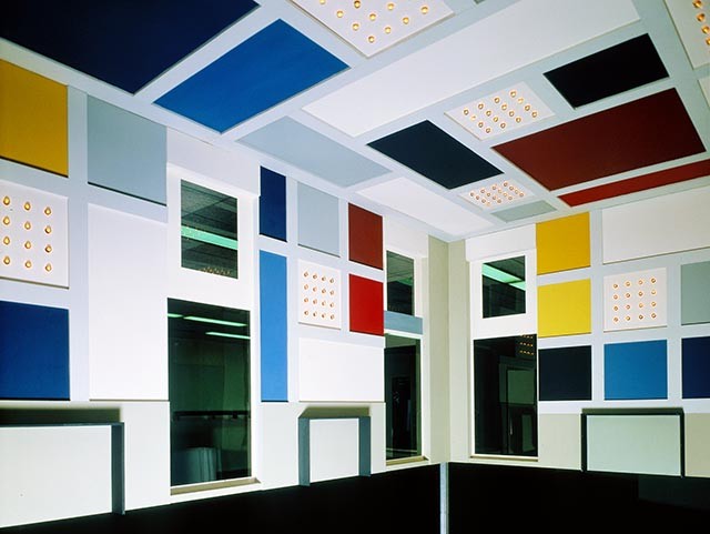
Theo van Doesburg, design interior dance hall L’Aubette, Strassbourg (1928) reconstruction 1968, scale 1 : 5 (detailfoto). Collection Van Abbemuseum, Eindhoven. Photo: Peter Cox
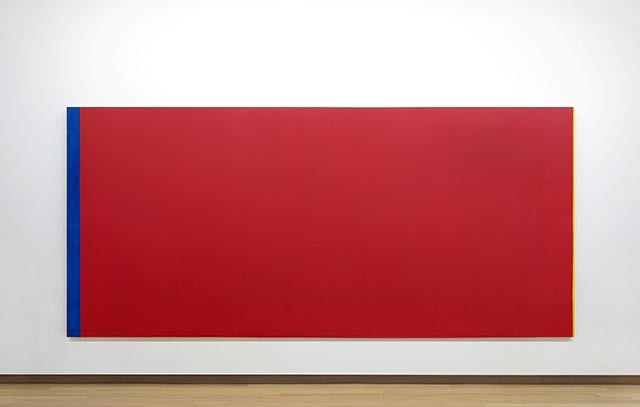
Barnett Newman, ‘Who’s Afraid of Red, Yellow and Blue III,’ 1967, 245x543cm. Collection Stedelijk Museum Amsterdam. C/o Pictoright
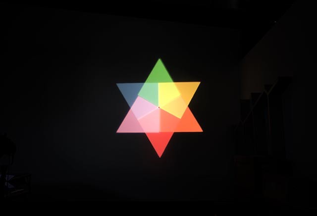
Olafur Eliasson, Ephermeral Afterimage Star, 2008. Courtesy: the artist
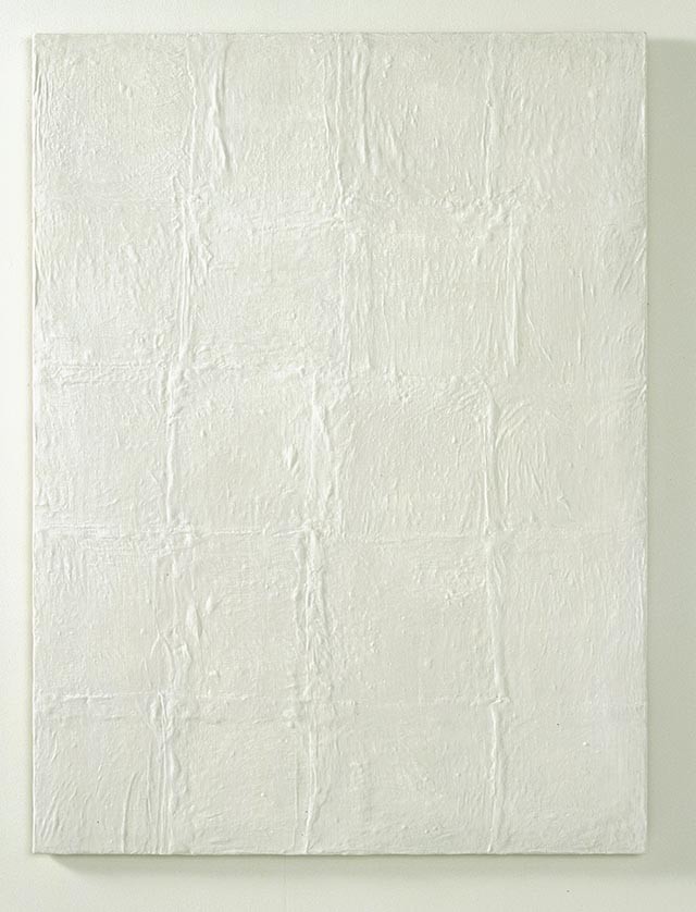
Piero Manzoni, Achrome,1958, 130 x 97 cm, porseleinaarde, linnen op jute. Collection Van Abbemuseum
THE COLOURS OF DE STIJL
6 May - 3 September 2017
Artists: Piet Mondriaan, Theo van Doesburg, Bart van der Leck, Gerrit Rietveld, Georges Vantongerloo, Vilmos Huszár, Barnett Newman, Josef Albers, Richard Paul Lohse, Jasper Johns, Yves Klein, Ad Reinhardt, Robert Ryman, Piero Manzoni, Alan Charlton, Richard Serra, Joseph Kosuth, Poul Gernes, Olafur Eliasson, De Rijke/De Rooij, Katja Mater, Jan van der Ploeg, Steven Aalders, Roy Villevoye, Fransje Killaars
Red, yellow and blue – the three primary colours have become synonymous with the art movement known as De Stijl. But that single iconic colour combination has tended to mask the reality of the diversity of ideas advanced by its various members. At the end of the day, Piet Mondrian, Theo van Doesburg, Bart van der Leck, Gerrit Rietveld, Georges Vantongerloo and Vilmos Huszár all formulated their own individual views on colour.
In this exhibition, Kunsthal KAdE zooms in on the use of colour by the six main exponents of De Stijl and goes on to examine how artists have continued to investigate the autonomous power of colour in the post-World War II period: from the abstract expressionism and concrete art of the 1960s and ’70s through to the work of artists who are today still exploring colour as an independent element. The Stedelijk Museum Amsterdam is lending top works like Barnett Newman’s ‘Who’s Afraid of Red, Yellow and Blue III’ and Jasper Johns’ triptych ‘Untitled’. The Van Abbemuseum is sending the architectural model of Theo van Doesburg’s proposed colour scheme for the auditorium of Strasbourg’s café/cinema ‘Aubette’, as well as works by Piero Manzoni, Richard Serra and Joseph Kosuth. And the studio of Olafur Eliasson is contributing the light installation ‘Ephemeral afterimage star’ (2008).
The exhibition is part of ‘Mondrian to Dutch Design’: a year-long programme of events taking place nationwide to mark the centenary of the launch of the De Stijl magazine. Events are being held in The Hague, Amersfoort, Utrecht, Otterlo, Eindhoven, the Northern Netherlands and Gelderland. ‘The Colours of De Stijl’ is scheduled to run from 6 May to 3 September 2017.
Theo van Doesburg, design interior dance hall L’Aubette, Strassbourg (1928) reconstruction 1968, scale 1 : 5 (detailfoto). Collection Van Abbemuseum, Eindhoven. Photo: Peter Cox
The starting point for the exhibition will be a series of small spaces setting out the varying positions of the De Stijl artists. Mondrian’s palette evolved over time from naturalistic to Luminist and on through brown/grey, pastel shades and primary colours to his final more richly variegated shades of red, yellow and blue. Van Doesburg and Huszár advocated the theories of chemist Wilhelm Ostwald, who thought the mixture of white and black with ‘full colours’ was important (ideas published, for example, in De Stijl in 1920). Van der Leck saw colour primarily as a means of making his figure pieces ‘more essential’. Vantongerloo developed a colour theory of his own, using pseudo-mathematical formulae to link colours to music and arriving at a system of seven colours. For Rietveld, finally, colour played a subservient and supporting role; he attached particular importance to the perceptions of the individual and the eye-catching power of primary colours.
The common denominator between all these artists was their desire to use colour as an independent element, ‘from art’ rather than ‘from nature’, on the basis of the idea that the right relationships between colours would produce ‘harmony’. After the heyday of De Stijl, their exploratory and analytical view of ‘colour’ was widely adopted.
In addition to major examples of the work of the selected artists, the exhibition will include documents concerning their colour concepts: not only drawings and letters, but books and other texts, and examples of colour theories on which their thinking was or is based. The colour theories of Wilhelm Ostwald will be examined in this context.
Displays in two small separate spaces will focus on specific topics: Theo van Doesburg’s 1928 design for the interior of café/cinema ‘Aubette’ in Strasbourg and Gerrit Rietveld’s 1950s designs for aircraft interiors. The latter display will include a full-scale 3D mock-up of the lounge area of a Lockheed L-188 Electra, built by furniture-maker Erwin Kwant on the basis of a Rietveld sketch.
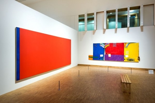
Great painting 'Who's Afraid of Red, Yellow and Blue III'
The section of the exhibition dealing with the post-World War II period will begin with Barnett Newman’s great painting ‘Who’s Afraid of Red, Yellow and Blue III’, now in the collection of the Stedelijk Museum. Newman sought to liberate the primary colours from the weight of De Stijl and other colour theories by using them expressively rather than didactically. Newman regarded the work of Mondrian, in particular, as decorative. Because his Neo-Plasticist disciples had made the primary colours so much their own, the Abstract Expressionists shied away from them. Newman re-appropriated them. In this context, the exhibition will look at the work of Josef Albers and Richard Paul Lohse (important colour theorists who had a major influence, especially on artists), as well as at Yves Klein, with his patented shade of blue
The exhibition will continue by exploring conceptual positions adopted by artists of the 1960s and ’70s in relation to colour. The artists concerned will include Piero Manzoni and Robert Ryman (for whom ‘white’ was so important, partly as an objective ‘non-colour’), Alan Charlton (who chose ‘grey’ as the most neutral colour), Richard Serra (who used intense black as an ‘architectural’ element) and Joseph Kosuth (interested in the definition of colour). This section will conclude with the work of Danish artist Poul Gernes, whose colour studies explored the social significance of artworks – an interest expressed, for example, in his exuberant colour schemes for the walls of Herlev Hospital in Copenhagen (1968-76).
Contemporary artists
The final part of the exhibition will take a look at contemporary artists. Olafur Eliasson will exhibit an installation focusing on the use of light to blend colour. Eliasson is fascinated by the ‘spectral colours’ that occur, for example, in natural phenomena like rainbows. On show in the video room will be De Rijke/De Rooij’s media-installation ‘Orange’, in which 88 slides are projected as a means of addressing the problem of using the colour orange on film. Katja Mater is fascinated by the colour theory of Isaac Newton, who showed that white light is composed of seven different colours. At the same time, she is interested in the phenomenon by which spinning colour wheels produce mixed shades (in an ideal situation, the colours will ‘merge’ to produce white). Mater repeats experiments conducted by colour theorists of the past, but in her case the process is rather one of deconstruction. Before the exhibition, Mater will be spending the early part of 2017 as artist in residence in Theo van Doesburg’s studio home in Meudon, a suburb of Paris.
Steven Aalders works with strictly ordered compositions of horizontal and vertical lines and blocks, which he constructs on the basis of colour schemes specific to each series and generally derived from examples in art history. Jan van der Ploeg makes monumental wall paintings with repeating geometrical patterns in strong colours. Finally, Roy Villevoye adopts an anthropological approach. For many years he has been visiting Papua New-Guinea to work with indigenous peoples there. For example, he picks up on a T-shirt ritual that is part of their culture and has three Papuans pose in T-shirts in the trio of colours used in colour printing: magenta, cyan and yellow. It is a collision of cultures brought about by colours that are ubiquitous in the Western world, but non-existent in the jungle of Papua New Guinea. Papuans don’t even have a word for ‘colour’
Catalog The Colours of De Stijl
Along with the exhibition ‘The Colours of De Stijl a rich illustrated catalog will appear. With texts by Robbert Roos, Marjory Degen and Nynke Besemer. With an introduction to the different color theories of Goethe, Newton and Ostwald written by Marjory Degen. The exhibition and catalog are divided into three sections: Artists of De Stijl, Artists after the war and contemporary artists. Buy the catalog in the KAdEShop or order the catalog online 15 euro (excluding shipping costs). | 96 pages, ISBN: EN: 978-94-90153-26-7
De Stijl year collaboration Amersfoort-Utrecht
This exhibition, ‘The Colours of De Stijl’, is part of the nationwide ‘Mondrian to Dutch Design’ centenary year celebrations. Events are being held in Utrecht, The Hague, Eindhoven, Otterlo, Drachten, Winterswijk and elsewhere.
Amersfoort and Utrecht have set up their own partnership within the overall organization of the celebrations. NBTC Holland Marketing is closely involved in the international promotion of the centenary. Following Rembrandt, Vermeer and Van Gogh, Mondrian is one of three new priorities for such promotion (the other two being Escher and Dick Bruna’s little rabbit Miffy). All the towns involved in the centenary year are contributing financially to the international marketing campaign. The programme of events in the Utrecht region will include not only ‘The Colours of De Stijl’ at Kunsthal KAdE (summer 2017), but also the creation of a completely new ‘Mondrian Experience’ at the Mondrian House in Amersfoort (opening 7 March 2017), an exhibition about the Rietveld Schröder House, entitled ‘Rietveld’s Masterpiece’, at the Centraal Museum in Utrecht (spring 2017), a show about Rietveld’s pavilions at the Rietveld Pavilion in Amersfoort (autumn 2017) and an exhibition on Dutch Design at the Centraal Museum (autumn 2017). In addition, work is being done on special De Stijl signposting for a high-speed bike route between Utrecht and Amersfoort. The commission for this has gone given to Utrecht artist Boris van Tellegen.
6 May - 3 September 2017
Artists: Piet Mondriaan, Theo van Doesburg, Bart van der Leck, Gerrit Rietveld, Georges Vantongerloo, Vilmos Huszár, Barnett Newman, Josef Albers, Richard Paul Lohse, Jasper Johns, Yves Klein, Ad Reinhardt, Robert Ryman, Piero Manzoni, Alan Charlton, Richard Serra, Joseph Kosuth, Poul Gernes, Olafur Eliasson, De Rijke/De Rooij, Katja Mater, Jan van der Ploeg, Steven Aalders, Roy Villevoye, Fransje Killaars
Red, yellow and blue – the three primary colours have become synonymous with the art movement known as De Stijl. But that single iconic colour combination has tended to mask the reality of the diversity of ideas advanced by its various members. At the end of the day, Piet Mondrian, Theo van Doesburg, Bart van der Leck, Gerrit Rietveld, Georges Vantongerloo and Vilmos Huszár all formulated their own individual views on colour.
In this exhibition, Kunsthal KAdE zooms in on the use of colour by the six main exponents of De Stijl and goes on to examine how artists have continued to investigate the autonomous power of colour in the post-World War II period: from the abstract expressionism and concrete art of the 1960s and ’70s through to the work of artists who are today still exploring colour as an independent element. The Stedelijk Museum Amsterdam is lending top works like Barnett Newman’s ‘Who’s Afraid of Red, Yellow and Blue III’ and Jasper Johns’ triptych ‘Untitled’. The Van Abbemuseum is sending the architectural model of Theo van Doesburg’s proposed colour scheme for the auditorium of Strasbourg’s café/cinema ‘Aubette’, as well as works by Piero Manzoni, Richard Serra and Joseph Kosuth. And the studio of Olafur Eliasson is contributing the light installation ‘Ephemeral afterimage star’ (2008).
The exhibition is part of ‘Mondrian to Dutch Design’: a year-long programme of events taking place nationwide to mark the centenary of the launch of the De Stijl magazine. Events are being held in The Hague, Amersfoort, Utrecht, Otterlo, Eindhoven, the Northern Netherlands and Gelderland. ‘The Colours of De Stijl’ is scheduled to run from 6 May to 3 September 2017.
Theo van Doesburg, design interior dance hall L’Aubette, Strassbourg (1928) reconstruction 1968, scale 1 : 5 (detailfoto). Collection Van Abbemuseum, Eindhoven. Photo: Peter Cox
The starting point for the exhibition will be a series of small spaces setting out the varying positions of the De Stijl artists. Mondrian’s palette evolved over time from naturalistic to Luminist and on through brown/grey, pastel shades and primary colours to his final more richly variegated shades of red, yellow and blue. Van Doesburg and Huszár advocated the theories of chemist Wilhelm Ostwald, who thought the mixture of white and black with ‘full colours’ was important (ideas published, for example, in De Stijl in 1920). Van der Leck saw colour primarily as a means of making his figure pieces ‘more essential’. Vantongerloo developed a colour theory of his own, using pseudo-mathematical formulae to link colours to music and arriving at a system of seven colours. For Rietveld, finally, colour played a subservient and supporting role; he attached particular importance to the perceptions of the individual and the eye-catching power of primary colours.
The common denominator between all these artists was their desire to use colour as an independent element, ‘from art’ rather than ‘from nature’, on the basis of the idea that the right relationships between colours would produce ‘harmony’. After the heyday of De Stijl, their exploratory and analytical view of ‘colour’ was widely adopted.
In addition to major examples of the work of the selected artists, the exhibition will include documents concerning their colour concepts: not only drawings and letters, but books and other texts, and examples of colour theories on which their thinking was or is based. The colour theories of Wilhelm Ostwald will be examined in this context.
Displays in two small separate spaces will focus on specific topics: Theo van Doesburg’s 1928 design for the interior of café/cinema ‘Aubette’ in Strasbourg and Gerrit Rietveld’s 1950s designs for aircraft interiors. The latter display will include a full-scale 3D mock-up of the lounge area of a Lockheed L-188 Electra, built by furniture-maker Erwin Kwant on the basis of a Rietveld sketch.
Great painting 'Who's Afraid of Red, Yellow and Blue III'
The section of the exhibition dealing with the post-World War II period will begin with Barnett Newman’s great painting ‘Who’s Afraid of Red, Yellow and Blue III’, now in the collection of the Stedelijk Museum. Newman sought to liberate the primary colours from the weight of De Stijl and other colour theories by using them expressively rather than didactically. Newman regarded the work of Mondrian, in particular, as decorative. Because his Neo-Plasticist disciples had made the primary colours so much their own, the Abstract Expressionists shied away from them. Newman re-appropriated them. In this context, the exhibition will look at the work of Josef Albers and Richard Paul Lohse (important colour theorists who had a major influence, especially on artists), as well as at Yves Klein, with his patented shade of blue
The exhibition will continue by exploring conceptual positions adopted by artists of the 1960s and ’70s in relation to colour. The artists concerned will include Piero Manzoni and Robert Ryman (for whom ‘white’ was so important, partly as an objective ‘non-colour’), Alan Charlton (who chose ‘grey’ as the most neutral colour), Richard Serra (who used intense black as an ‘architectural’ element) and Joseph Kosuth (interested in the definition of colour). This section will conclude with the work of Danish artist Poul Gernes, whose colour studies explored the social significance of artworks – an interest expressed, for example, in his exuberant colour schemes for the walls of Herlev Hospital in Copenhagen (1968-76).
Contemporary artists
The final part of the exhibition will take a look at contemporary artists. Olafur Eliasson will exhibit an installation focusing on the use of light to blend colour. Eliasson is fascinated by the ‘spectral colours’ that occur, for example, in natural phenomena like rainbows. On show in the video room will be De Rijke/De Rooij’s media-installation ‘Orange’, in which 88 slides are projected as a means of addressing the problem of using the colour orange on film. Katja Mater is fascinated by the colour theory of Isaac Newton, who showed that white light is composed of seven different colours. At the same time, she is interested in the phenomenon by which spinning colour wheels produce mixed shades (in an ideal situation, the colours will ‘merge’ to produce white). Mater repeats experiments conducted by colour theorists of the past, but in her case the process is rather one of deconstruction. Before the exhibition, Mater will be spending the early part of 2017 as artist in residence in Theo van Doesburg’s studio home in Meudon, a suburb of Paris.
Steven Aalders works with strictly ordered compositions of horizontal and vertical lines and blocks, which he constructs on the basis of colour schemes specific to each series and generally derived from examples in art history. Jan van der Ploeg makes monumental wall paintings with repeating geometrical patterns in strong colours. Finally, Roy Villevoye adopts an anthropological approach. For many years he has been visiting Papua New-Guinea to work with indigenous peoples there. For example, he picks up on a T-shirt ritual that is part of their culture and has three Papuans pose in T-shirts in the trio of colours used in colour printing: magenta, cyan and yellow. It is a collision of cultures brought about by colours that are ubiquitous in the Western world, but non-existent in the jungle of Papua New Guinea. Papuans don’t even have a word for ‘colour’
Catalog The Colours of De Stijl
Along with the exhibition ‘The Colours of De Stijl a rich illustrated catalog will appear. With texts by Robbert Roos, Marjory Degen and Nynke Besemer. With an introduction to the different color theories of Goethe, Newton and Ostwald written by Marjory Degen. The exhibition and catalog are divided into three sections: Artists of De Stijl, Artists after the war and contemporary artists. Buy the catalog in the KAdEShop or order the catalog online 15 euro (excluding shipping costs). | 96 pages, ISBN: EN: 978-94-90153-26-7
De Stijl year collaboration Amersfoort-Utrecht
This exhibition, ‘The Colours of De Stijl’, is part of the nationwide ‘Mondrian to Dutch Design’ centenary year celebrations. Events are being held in Utrecht, The Hague, Eindhoven, Otterlo, Drachten, Winterswijk and elsewhere.
Amersfoort and Utrecht have set up their own partnership within the overall organization of the celebrations. NBTC Holland Marketing is closely involved in the international promotion of the centenary. Following Rembrandt, Vermeer and Van Gogh, Mondrian is one of three new priorities for such promotion (the other two being Escher and Dick Bruna’s little rabbit Miffy). All the towns involved in the centenary year are contributing financially to the international marketing campaign. The programme of events in the Utrecht region will include not only ‘The Colours of De Stijl’ at Kunsthal KAdE (summer 2017), but also the creation of a completely new ‘Mondrian Experience’ at the Mondrian House in Amersfoort (opening 7 March 2017), an exhibition about the Rietveld Schröder House, entitled ‘Rietveld’s Masterpiece’, at the Centraal Museum in Utrecht (spring 2017), a show about Rietveld’s pavilions at the Rietveld Pavilion in Amersfoort (autumn 2017) and an exhibition on Dutch Design at the Centraal Museum (autumn 2017). In addition, work is being done on special De Stijl signposting for a high-speed bike route between Utrecht and Amersfoort. The commission for this has gone given to Utrecht artist Boris van Tellegen.