
Brigitte Waldach
20 Feb - 17 Mar 2012
BRIGITTE WALDACH
Pathos
20 January - 17 March, 2012
Lena Nievers in conversation with Brigitte Waldach
The term, 'pathos', the title Brigitte Waldach has chosen for this exhibition, refers, in general parlance, to a solemn emotional state. At a time when the longing for high emotions and grand stagings collides with a desire, no less strongly felt, for authenticity, the term is often employed with a certain mistrust. Pathos is suspect ed of masking 'true' feelings or even of replacing them.
Brigitte Waldach grapples with the notion of 'pathos' in the most varied of ways. Her exhibition combines an installation, spread over two rooms, which also bears the title, Pathos, and a selection of her current drawings. The exhibited works interlink with one another in both form and content. For the first time for many years, Brigitte Waldach augments the reds of her play of colours with graphite grey shades. However, it is the 'pathos' theme, above all, that runs as a leitmotif through all of the works on display. It is to be found in the landscape elements in Present Slips and Vita Contemplativa, which remind one of the art of the Romantics, just as much as in the repeated motif of the emotionally-charged star symbol that the viewer encounters in the installation, in the drawing Pathos I, as well as in the various literary references. However closely the works are intertwined conceptually, they are not dependent on one another. Each work is self-contained and conveys a meaning that transcends the common theme.
Finally there is also pathos in the spectrum produced by the sequence of exhibited works - which culminates dramatically in the last room. To the strains of The Doors' song, The End, the viewer enters a Gothic cathedral constructed of rough sketchy strokes on the walls and ceiling. Only the tracery of the rose window on the end wall of the space is drawn in detail, although it has been shifted sideways from its correct position within the sketched architecture. A bright circle of light projected onto the wall gives the impression that the rays of light possess the power to displace a solid piece of masonry. This 'trick' is so evident that the brain sees through it immediately, although the illusion loses none of its magic. In fact, perhaps it is the case, that we are able to give ourselves up to the pathos in Brigitte Waldach's works with such pleasure, precisely because on another level they always contain the rational, analytical gaze - and demand it of us.
LN: In the installation, Pathos and your current drawings, you address something that has actually resonated for some time throughout your works: in the motifs taken from horror movies and the Heimatfilm ('homeland film') genre, in the dramatic composition of your large space-sound installations, in your choice of the colour red ...
BW: Choosing the word, 'pathos' as the title of the exhibition is, of course, as ambivalent as the meaning of the term itself. Only very few people are interested in the complexities of the term, while the majority are probably more likely to be thinking of the emotional staging of grand sentiments. Of course, the set pieces in my art have been taken from our cultural history and act as quotations from these notions of staging. Yet by drawing on the past, we understand the present and, at times, are able to intuit the future.
LN: In the last room of the installation, you invert the relationship between materiality and immateriality and create the illusion, that the light falling in has been able to push aside the tracery of the cathedral's rose window. Per Kirkeby, who dealt at length with the relationship between art and reality, writes in one of his essays that he sometimes believes, "the sole true reality is that which is created in images by humans. This so-called 'true reality' cannot be trusted; it is merely shapeless materiality. A materiality we employ to create a reality in which we can live [...]."
BW: It is sometimes necessary to dismantle familiar values in order to make space for the new. At the start, I thought about reception in general terms. When are we moved; when are we touched? People often experience being moved as something unpleasant, but being moved suggests movement, and by means of this movement we can distance ourselves from fixed perspectives, even free ourselves from them. Pathos places us within a larger context.
The terms, 'reality' and 'truth' are merely agreements reached within a given culture. As soon as we leave our country or our cultural sphere, references get complicated. However, in the abstraction of an artistic solution, there is always more latitude than there is in a pure, rather more documentary image - or in a national cultural construction. This is how I would translate Per Kirkeby's hypothesis into the terms of my own work.
LN: After you introduced the five-pointed red stars into your earlier works about the Red Army Faction, since 2010 you have produced drawings and installations in which a whole variety of star symbols appear. Most of these symbols have undergone several changes in meaning over time and can be found in various cultural circles. In your works, all of these meanings exist alongside one another. Without being associated with specific contexts, the symbols lose their function as unambiguous signs, although they remain emotionally charged.
BW: A cultural sign becomes a symbol when it continues to be read as unlimited, polyvalent and ultimately enigmatic. For this reason, it seems sensible to me to liberate signs from unambiguous national, religious and cultural contexts.
LN: With the exception of Disaster, the exhibited drawings are all populated; in the installation, on the other hand, you forego figures completely. One could read that as visitors encountering your figures in the first room of the exhibition and then subsequently taking their place in the drawn space. When you design an installation like this one, do you incorporate from the start the interaction of visitors with the (real and intellectual) space you have created? Do they become, if you like, 'your' figures?
BW: I constantly try to rid my work of the figure as a drawn motif, but I have only very seldom managed it. In the end, it always proved necessary both in terms of content and for compositional reasons.
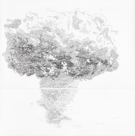
However, when I review the drawings in the Pathos show, the figural presence seems to me less direct. The props, the symbols and the landscape indicated are the actual 'pathetic' fields of projection. The explosion cloud seems to me to be the most powerful and vivid image in the exhibition, even though the figure as motif is no longer featured. However, in this erupting explosion of text, we are acutely confronted on another level with the (linguistic) traces of human existence.
For me the drawings in the installation have tipped over into the third dimension. In these walk-through spatial images, I no longer need the figure as a drawn element. The visitor to the exhibition takes on this role - almost like a flexible compositional element which is incalculable for me and remains unique, dependent only on itself within this interaction.
LN: The colour red, with which you have almost exclusively worked over the last few years, is very heavily charged emotionally - love, anger, life and death, political fervour - all sorts of associations are linked with the colour of a drawing alone. The grey in the most recent works, on the other hand, is much more neutral - and it makes reference to the tradition of Classical drawings in pencil. I find it interesting that you have taken this step just at the moment when you address the issue of pathos.
BW: At first, I spontaneously associated architecture and the representation of power with the term 'pathos'. The colour grey represents these notions. In general, I work with colour coding. Each nuance of colour is an indicator of a different source. When in fact I do shift from one colour to another, in this case, red to grey, it is not just about a change of colour, but also one of media. Here, I use the medium of pencil/graphite like an architectonic element. Even where landscape is indicated, such as trees, the surface is so even and intensively worked, that it might be a metallic object that is being represented. For this reason, these visual elements are operating, formally and in terms of content, on the level of the symbols within the installation which are made of milled aluminium. The graphite surface in my drawings is soft and shiny at one and the same time; it absorbs and reflects light.
LN: The first drawing in which you worked in pencil is Bleierne Zeit (Future) [Leaden Times] In this case, the coloration mirrors to a certain degree the associations made by the title, in terms of its content, and resonates with the line from the poem Der Gang aufs Land (The Walk in the Country) by Hölderlin. However - at least in today's (German) consciousness - it also evokes the 'leaden times' of Baader-Meinhof terror. The drawn figure in red of a young man is overlaid by the rows of numbers like bars; the 'leaden times' could also be the burden of history in which everyone of us is more or less im plicated, the influence of which stretches far into the future.
Some of the dates are accentuated by means of a red border. In conversation, you revealed to me that they are years that have personal significance for you. Each viewer will look at the image, however, with his or her own 'key dates' in mind, whether they are private ones or those relating to historical events.
BW: Aside from the ideas, which you mentioned in relation to Bleierne Zeit, I also refer - in respect of our parents' generation - to the period of the 1950s, when people seemed frozen, unable to move forward, oppressed by the weight of the unresolved history of National Socialism.
Every date which we associate with our life carries references not only to individual experiences but also to historical events. Sometimes personal and societal experiences are intertwined, but what we remember, in respect of specific dates, can not be fore seen and will also depend on the nature and time of this confrontation. By the way, the dates highlighted by me do not just refer to personal things, but are also code for historical periods associated with the motifs featured in the exhibition.
LN: In the installation, the graphite grey is the coloration of the cathedral architecture and the 'rays of light' which are also lent something of the architectural structure in this way. Aside from this, it is also continued in the drawings on the walls indicating trees. In some of your recent drawings you have employed blue and green for motifs such as water and forest. By contrast, I see the grey forest of the Pathos installation, which in terms of colour and the degree of abstraction is so closely related to the architecture and the symbolic forms, less as associated with these 'landscape images' and more as connected to the 'German forest' of your works about the Red Army Faction.
BW: The 'German forest' is a central motif of the Pathos exhibition. Aside from the psychoanalytical meanings associated with this topos, the forest had previously been a metaphor for personal and cultural experiences, not just in German art and cultural history. The forest is a symbol to be found in the most diverse cultural spheres, also as a psychological myth, that is, as a place of initiation.
LN: It is unbelievable how many layers of potential associated links there are between the exhibited works. For instance, even Disaster could be seen in relation with the installation. In this way, the ripples caused by the detonation might be seen as another reason for the displaced tracery. Are such links within an exhibition welcome coincidences or do you explicitly plan for them to be there?
BW:Much of it comes up during the research or the conception and production of the image. The exhibition develops and in this developmental phase the links become clearer. Sometimes the frames of reference explode and thus innumerable - freely floating - links become possible. However, the individual points of reference and associations made by the visitors and viewers, I cannot plan in advance - thank goodness. Humans remain unpredictable, which, for me, is a liberating realisation.
Pathos
20 January - 17 March, 2012
Lena Nievers in conversation with Brigitte Waldach
The term, 'pathos', the title Brigitte Waldach has chosen for this exhibition, refers, in general parlance, to a solemn emotional state. At a time when the longing for high emotions and grand stagings collides with a desire, no less strongly felt, for authenticity, the term is often employed with a certain mistrust. Pathos is suspect ed of masking 'true' feelings or even of replacing them.
Brigitte Waldach grapples with the notion of 'pathos' in the most varied of ways. Her exhibition combines an installation, spread over two rooms, which also bears the title, Pathos, and a selection of her current drawings. The exhibited works interlink with one another in both form and content. For the first time for many years, Brigitte Waldach augments the reds of her play of colours with graphite grey shades. However, it is the 'pathos' theme, above all, that runs as a leitmotif through all of the works on display. It is to be found in the landscape elements in Present Slips and Vita Contemplativa, which remind one of the art of the Romantics, just as much as in the repeated motif of the emotionally-charged star symbol that the viewer encounters in the installation, in the drawing Pathos I, as well as in the various literary references. However closely the works are intertwined conceptually, they are not dependent on one another. Each work is self-contained and conveys a meaning that transcends the common theme.
Finally there is also pathos in the spectrum produced by the sequence of exhibited works - which culminates dramatically in the last room. To the strains of The Doors' song, The End, the viewer enters a Gothic cathedral constructed of rough sketchy strokes on the walls and ceiling. Only the tracery of the rose window on the end wall of the space is drawn in detail, although it has been shifted sideways from its correct position within the sketched architecture. A bright circle of light projected onto the wall gives the impression that the rays of light possess the power to displace a solid piece of masonry. This 'trick' is so evident that the brain sees through it immediately, although the illusion loses none of its magic. In fact, perhaps it is the case, that we are able to give ourselves up to the pathos in Brigitte Waldach's works with such pleasure, precisely because on another level they always contain the rational, analytical gaze - and demand it of us.
LN: In the installation, Pathos and your current drawings, you address something that has actually resonated for some time throughout your works: in the motifs taken from horror movies and the Heimatfilm ('homeland film') genre, in the dramatic composition of your large space-sound installations, in your choice of the colour red ...
BW: Choosing the word, 'pathos' as the title of the exhibition is, of course, as ambivalent as the meaning of the term itself. Only very few people are interested in the complexities of the term, while the majority are probably more likely to be thinking of the emotional staging of grand sentiments. Of course, the set pieces in my art have been taken from our cultural history and act as quotations from these notions of staging. Yet by drawing on the past, we understand the present and, at times, are able to intuit the future.
LN: In the last room of the installation, you invert the relationship between materiality and immateriality and create the illusion, that the light falling in has been able to push aside the tracery of the cathedral's rose window. Per Kirkeby, who dealt at length with the relationship between art and reality, writes in one of his essays that he sometimes believes, "the sole true reality is that which is created in images by humans. This so-called 'true reality' cannot be trusted; it is merely shapeless materiality. A materiality we employ to create a reality in which we can live [...]."
BW: It is sometimes necessary to dismantle familiar values in order to make space for the new. At the start, I thought about reception in general terms. When are we moved; when are we touched? People often experience being moved as something unpleasant, but being moved suggests movement, and by means of this movement we can distance ourselves from fixed perspectives, even free ourselves from them. Pathos places us within a larger context.
The terms, 'reality' and 'truth' are merely agreements reached within a given culture. As soon as we leave our country or our cultural sphere, references get complicated. However, in the abstraction of an artistic solution, there is always more latitude than there is in a pure, rather more documentary image - or in a national cultural construction. This is how I would translate Per Kirkeby's hypothesis into the terms of my own work.
LN: After you introduced the five-pointed red stars into your earlier works about the Red Army Faction, since 2010 you have produced drawings and installations in which a whole variety of star symbols appear. Most of these symbols have undergone several changes in meaning over time and can be found in various cultural circles. In your works, all of these meanings exist alongside one another. Without being associated with specific contexts, the symbols lose their function as unambiguous signs, although they remain emotionally charged.
BW: A cultural sign becomes a symbol when it continues to be read as unlimited, polyvalent and ultimately enigmatic. For this reason, it seems sensible to me to liberate signs from unambiguous national, religious and cultural contexts.
LN: With the exception of Disaster, the exhibited drawings are all populated; in the installation, on the other hand, you forego figures completely. One could read that as visitors encountering your figures in the first room of the exhibition and then subsequently taking their place in the drawn space. When you design an installation like this one, do you incorporate from the start the interaction of visitors with the (real and intellectual) space you have created? Do they become, if you like, 'your' figures?
BW: I constantly try to rid my work of the figure as a drawn motif, but I have only very seldom managed it. In the end, it always proved necessary both in terms of content and for compositional reasons.
However, when I review the drawings in the Pathos show, the figural presence seems to me less direct. The props, the symbols and the landscape indicated are the actual 'pathetic' fields of projection. The explosion cloud seems to me to be the most powerful and vivid image in the exhibition, even though the figure as motif is no longer featured. However, in this erupting explosion of text, we are acutely confronted on another level with the (linguistic) traces of human existence.
For me the drawings in the installation have tipped over into the third dimension. In these walk-through spatial images, I no longer need the figure as a drawn element. The visitor to the exhibition takes on this role - almost like a flexible compositional element which is incalculable for me and remains unique, dependent only on itself within this interaction.
LN: The colour red, with which you have almost exclusively worked over the last few years, is very heavily charged emotionally - love, anger, life and death, political fervour - all sorts of associations are linked with the colour of a drawing alone. The grey in the most recent works, on the other hand, is much more neutral - and it makes reference to the tradition of Classical drawings in pencil. I find it interesting that you have taken this step just at the moment when you address the issue of pathos.
BW: At first, I spontaneously associated architecture and the representation of power with the term 'pathos'. The colour grey represents these notions. In general, I work with colour coding. Each nuance of colour is an indicator of a different source. When in fact I do shift from one colour to another, in this case, red to grey, it is not just about a change of colour, but also one of media. Here, I use the medium of pencil/graphite like an architectonic element. Even where landscape is indicated, such as trees, the surface is so even and intensively worked, that it might be a metallic object that is being represented. For this reason, these visual elements are operating, formally and in terms of content, on the level of the symbols within the installation which are made of milled aluminium. The graphite surface in my drawings is soft and shiny at one and the same time; it absorbs and reflects light.
LN: The first drawing in which you worked in pencil is Bleierne Zeit (Future) [Leaden Times] In this case, the coloration mirrors to a certain degree the associations made by the title, in terms of its content, and resonates with the line from the poem Der Gang aufs Land (The Walk in the Country) by Hölderlin. However - at least in today's (German) consciousness - it also evokes the 'leaden times' of Baader-Meinhof terror. The drawn figure in red of a young man is overlaid by the rows of numbers like bars; the 'leaden times' could also be the burden of history in which everyone of us is more or less im plicated, the influence of which stretches far into the future.
Some of the dates are accentuated by means of a red border. In conversation, you revealed to me that they are years that have personal significance for you. Each viewer will look at the image, however, with his or her own 'key dates' in mind, whether they are private ones or those relating to historical events.
BW: Aside from the ideas, which you mentioned in relation to Bleierne Zeit, I also refer - in respect of our parents' generation - to the period of the 1950s, when people seemed frozen, unable to move forward, oppressed by the weight of the unresolved history of National Socialism.
Every date which we associate with our life carries references not only to individual experiences but also to historical events. Sometimes personal and societal experiences are intertwined, but what we remember, in respect of specific dates, can not be fore seen and will also depend on the nature and time of this confrontation. By the way, the dates highlighted by me do not just refer to personal things, but are also code for historical periods associated with the motifs featured in the exhibition.
LN: In the installation, the graphite grey is the coloration of the cathedral architecture and the 'rays of light' which are also lent something of the architectural structure in this way. Aside from this, it is also continued in the drawings on the walls indicating trees. In some of your recent drawings you have employed blue and green for motifs such as water and forest. By contrast, I see the grey forest of the Pathos installation, which in terms of colour and the degree of abstraction is so closely related to the architecture and the symbolic forms, less as associated with these 'landscape images' and more as connected to the 'German forest' of your works about the Red Army Faction.
BW: The 'German forest' is a central motif of the Pathos exhibition. Aside from the psychoanalytical meanings associated with this topos, the forest had previously been a metaphor for personal and cultural experiences, not just in German art and cultural history. The forest is a symbol to be found in the most diverse cultural spheres, also as a psychological myth, that is, as a place of initiation.
LN: It is unbelievable how many layers of potential associated links there are between the exhibited works. For instance, even Disaster could be seen in relation with the installation. In this way, the ripples caused by the detonation might be seen as another reason for the displaced tracery. Are such links within an exhibition welcome coincidences or do you explicitly plan for them to be there?
BW:Much of it comes up during the research or the conception and production of the image. The exhibition develops and in this developmental phase the links become clearer. Sometimes the frames of reference explode and thus innumerable - freely floating - links become possible. However, the individual points of reference and associations made by the visitors and viewers, I cannot plan in advance - thank goodness. Humans remain unpredictable, which, for me, is a liberating realisation.